User Interface
Welcome to the User Interface guide for RNGNeeds! As a Unity plugin designed with ease-of-use in mind, we've made sure our UI is intuitive and user-friendly. This guide will help you navigate through the interface and make the most out of RNGNeeds' powerful features. From understanding the Probability List Drawer to using our dynamic Stripe widget, we'll cover all you need to know to confidently manage and design your probability lists within the Unity Inspector. Let's dive in and explore the user interface of RNGNeeds, your essential tool for managing randomness in your game design.
Basic Anatomy
The RNGNeeds Inspector drawer is comprised of three distinct sections - the Header Bar, the Probability Stripe, and the Item List. Each of these sections has a unique function in the process of creating and managing your Probability Lists.
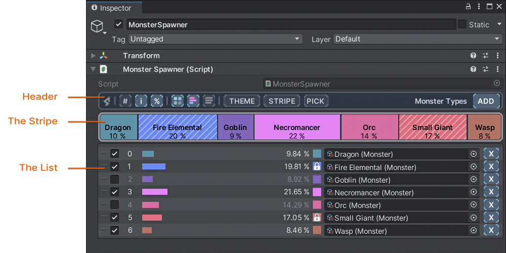
Header Bar
The Header Bar is your control panel in the RNGNeeds Inspector drawer. It allows you to customize the drawer, adjust options for your Probability List, and add new items to the list.
The Stripe
A visual tool in the RNGNeeds Inspector that represents your items as colored blocks, with their width proportional to their probability. It allows you to visually adjust the probabilities of each item by dragging their edges or the blocks themselves.
The List
This is where your items are displayed in the RNGNeeds Inspector. Each entry provides information such as enable/disable toggle, index, probability preview bar, exact probability value, color code, and the option to remove the item from the list.
Header Bar
The Header Bar sits at the top of the RNGNeeds Inspector drawer. It's where you make global adjustments and customizations. Here, you can see the name of your property displayed next to the Add button, which is used for adding new items to your Probability List.
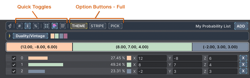
In the left section of the header bar, Quick Toggles are located, represented by small rectangular buttons, that allow you to control various display options. These include showing or hiding item information on the Stripe, dimming colors, and managing preview bars in the List. Learn more about these options on our Customizing Lists page of the docs.
Next to the Quick Toggles on the right, there are Option Buttons, which expand a sub-section of the drawer for customizing the Theme colors, Stripe height, and Pick controls.
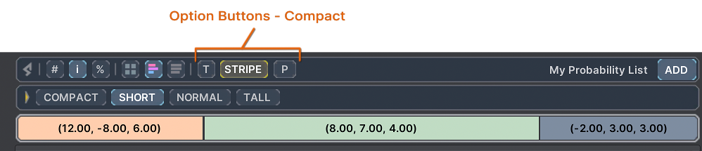
There are three settings for the appearance of these Option Buttons that you can customize globally in the RNGNeeds Preferences:
- Full - the default setting where the buttons display the name of the section in full.
- Compact - useful if you have limited inspector space. Only the expanded section will display the full name.
- Informative - with this setting, the Option Buttons will display the settings of the section directly within the button.
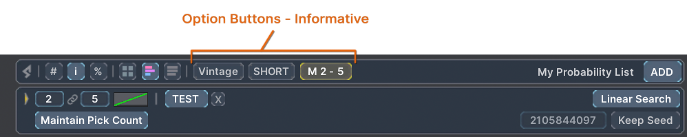
With Informative Option Buttons, the color palette, stripe height, and the pick settings are shown within the button.

The Pick button provides a concise overview of the list's selection logic, clearly displaying the current settings without the need to open the Pick section:
- The letter M signifies that the Maintain Pick Count option for this list is active.
- The numbers 2 - 5 indicate the minimum and maximum values for the Pick Count.
- The numbers in brackets [8 - 13] show the available and maximum Units for a Depletable List.
- Lastly, the Repeat Prevention method in use is displayed, in this case, Spread.
The Stripe
The Stripe is a powerful visual tool that lets you design and adjust your probabilities intuitively. Each item in your Probability List is represented as a colored block on the Stripe. The width of these blocks is proportional to their associated probabilities, and together they fill up the whole Stripe, representing a total probability value of 1.
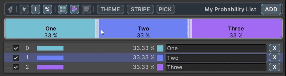
By dragging the edges between these blocks or the blocks themselves, you can adjust the probabilities of your items. For fine-tuning, you can hold Ctrl while scrolling to adjust probabilities by 0.1%, or Ctrl+Shift for a precision of 0.01%. The colors of the blocks correspond to those of the items in the List, providing a visually consistent reference across the interface.
If the scroll direction feels unintuitive (for example on Mac OS with 'natural' setting on), you can reverse it. Visit the Preferences Section to learn more about additional and advanced options.
The List
The List is where your items are neatly laid out. Each item in the List has several properties displayed. From left to right, these are: an enable/disable toggle, index, a preview bar that visually represents the item's probability, the exact probability value, a color code, and a remove item button.
The color code square not only provides a visual reference for the item's color, but also acts as a lock to protect the item's probability from accidental changes or recalculation. By clicking the color code square, you can lock or unlock the item. The remaining space of the item entry is reserved for the value field, where you can interact with your item's value directly, be it a primitive type or a complex Unity object type.
That's the basic rundown of the three main sections of the RNGNeeds Inspector drawer. Dive in and explore these features further to truly make the most of RNGNeeds.